Dec 19, 2019
Staff+
What will be the color of 2020?

Two different shades, one common theme: relaxation.
It’s a well-known fact that color not only has a tremendous impact on human emotions, it also physically influences us. Blue is the color of meditation, while light green evokes tranquillity, recalling the sunrise.
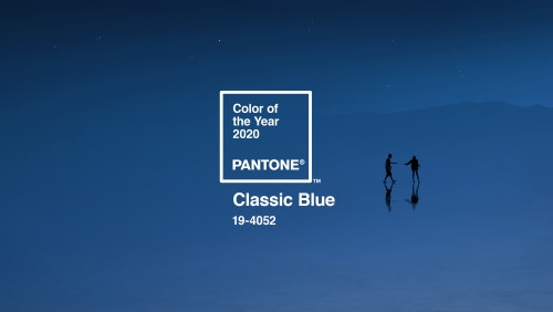
Blue is the Pantone's color of the year
The color blue, often associated with meditation, fosters.
oncentration and generates calmness, tranquillity and serenity. It stimulates deep feelings, reduces anxiety and brings balance to our emotional realm.
PANTONE has selected the timeless Classic Blue 19-4052 as its Color of the Year.
“Creating a stable foundation on which to build, PANTONE 19-4052 Classic Blue injects creative confidence into interiors, transforming a space through unique color combinations and tonal statements. Easily applied across so many different materials, textures, and finishes, it is a dependable blue that can take you in many different directions,” states the Pantone company.

In interior design, blue is often used in bedrooms, frequently applied on both walls and ceilings to create a type of nest-space which offers a refuge for escaping the chaos of daily life.
To compensate the intensity of this color, it can be matched with lighter, subdued shades, particularly with materials in warmer tones such as wood and carpets.
Profilitec's vision for Pantone's Classic Blue
To brighten Classic Blue, we suggest matching this intense color with anodized aluminum profiles or, for public spaces like hotels and spas, decorative profiles in brilliant polished or glittered finishes.
To find out more about decorative profiles.
To find out more about glittered profiles.
Other color trends: a tribute to dawn
The theme of 2020 is centered around profound human feelings and psychophysical wellbeing.
Eliminating stress, relaxing the body and mind are imperative in preserving our personal wellness. Studies have analyzed how natural light positively impacts humans and how early exposure to sunlight helps to regulate our bodies. A good time to free our mind of the stress that builds up daily is at daybreak, admiring the sunrise from our favorite spot.

The color of the year chosen by another color manufacturer is, in fact, dedicated to dawn: a shade which combines hues of green, blue and grey. Tranquil Dawn is an opaque, delicate color that can be used along with numerous subdued chromatic combinations while also introducing brighter pops of color.

Credits: Sikkens color palettes
Profilitec's vision of tranquil dawn
Alongside these color tones, we propose a line with opaque, material finishes: Modern Line.
Conceived for wall ceramic tile, Modern Line’s leading elements are the SJ squared profiles, the rounded RJ and the discreet KJ – all multifunctional profiles primarily used for trimming corners and protecting delicate tile edges.
To find out more about the Wall Modern Line.
What's your color choise for 2020? Classic Blue or Tranquil Dawn?
These two hues are certainly very different, so let’s sum up their main characteristics:
- Classic Blue is intense and always the protagonist. Match this color with secondary shades that won’t compete with its prominence. Recommended for bedrooms.
- Tranquil Dawn is the perfect neutral. Use it in all kinds of pastel color combinations. It can be inserted into any interior, though it’s specifically recommended for living areas.
Tags:
Comments
There is no comment
Leave a comment
Staff+
Dec 26, 2019